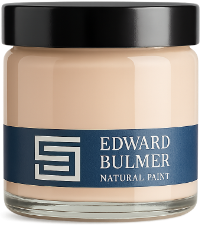
How to choose and use paint sample pots: a step-by-step guide Choosing the right paint colour takes more than a glance at a colour card. Discover how to use sample pots to understand colour in your own home, from changing natural light to furniture and fabrics, with practical tips for confidently choosing the perfect shade.
A colourful new chapter for a Salcombe fisherman’s cottage Step inside a much-loved fisherman’s cottage near Salcombe, where historic character meets joyful colour. Discover how Edward Bulmer Natural Paint, thoughtful design and clever details have transformed this family home into a colourful and beautifully considered retreat.
One colour, endless possibilities – discover the Shade Collection Discover how decorating with different shades of the same colour can transform your home. From creating a cohesive colour scheme to choosing the right paint for changing natural light, explore the Edward Bulmer Natural Paint Shade Collection and learn how tonal decorating can bring harmony, depth and timeless elegance to every room.
How natural light should influence your paint colour choices The same paint colour can reveal a completely different character from morning to evening. Explore how natural light shapes our perception of colour, with practical guidance on choosing the right natural paint shade for every aspect of your home.
How to choose the best white paint for ceilings and woodwork Choosing the right white for your ceiling and woodwork can transform a room. Discover why brilliant white isn’t always the best choice and explore Edward Bulmer’s expert recommendations for beautifully balanced interiors.
How to choose the perfect pigmented white paint for your home Discover how to choose the perfect pigmented white paint for every room in your home. Learn why natural pigments create softer, more harmonious interiors and explore Edward Bulmer’s beautifully nuanced whites.
Orange paint colours: natural shades inspired by summer living When we think of summer decorating, our minds often drift towards cool blues and fresh whites. Yet one of the colours most deeply connected to the season is often overlooked: orange. Read on to discover more.
The rise of plant-based paint in modern interior design For decades, decorating has largely been driven by colour trends, finish and durability. Increasingly though, homeowners and designers are asking a deeper question: what is actually in the paint we bring into our homes?
The hidden luxury of a larder: how to create a beautiful pantry in any home A larder brings order and calm to everyday life. Whether it is a walk-in pantry, an under-stairs cupboard or a fitted kitchen cabinet, this hardworking space offers the perfect opportunity to combine practical storage with joyful colour.
Our Precious Earth Palette, in collaboration with the Soil Association Created with the Soil Association for its 80th anniversary, Our Precious Earth Palette reflects a shared commitment to the natural world and the health of the land. Twelve colours, made from earth and mineral pigments, draw directly from nature it captures the quiet rhythms of the year.