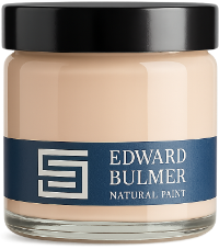
Choosing the right paint colour for your home can be surprisingly difficult. A shade that looks perfect on a screen or colour card can feel quite different once you see it in your own space. Colour is influenced by everything around it, from the direction your room faces and the natural and artificial light it receives to your flooring, furniture, fabrics and existing colours. That’s why testing paint colours at home is such an important part of the decorating process. Sample pots allow you to see the actual paint colour in your own room, while our painted A5 colour swatches offer a useful way to move colours around and compare several options before making your final decision. Here is our step-by-step guide to choosing and testing paint colours at home. Request a free Colour Chart Step 1: Think about your room Before choosing colours, take a moment to consider the room you are decorating. Think about: What is the room used for? A bedroom might call for a very different atmosphere from a busy kitchen or sitting room. Which direction does it face? North, south, east and west-facing rooms each have their own quality of light. How much natural light does it receive? A bright, sunny room will respond to colour differently from a darker space. What colours and materials are already there? Look at flooring, furniture, curtains, upholstery, artwork and architectural details. These elements all affect how a paint colour will appear, so it is better to work with them than choose a colour in isolation. Living Room in London Brown. Photography by Paul Whitbread Hallway in Lilac Pink with Pompadour woodwork. Photography by Tom St.Aubyn Kitchen painted in Ochre Step 2: Choose a shortlist of colours Rather than trying to find one perfect colour immediately, begin with a shortlist of around three to six shades. Look at colours that are similar but have different undertones, as these differences can become much more apparent once you see them in your own room. It can be useful to include a couple of closely related shades, one or two alternatives you might not initially have considered and even a wildcard slightly outside your comfort zone. Sometimes the unexpected colour is the one that brings everything else in the room together. If you are decorating adjoining rooms, consider your colours as a whole. They don’t need to match, but looking at them alongside one another will help you create a more cohesive scheme. Step 3: Choose how to sample your paint colours A colour card is an excellent starting point, but testing your shortlist at home gives you a much better understanding of how each colour will behave in the space. Our A5 colour swatches are painted with real Edward Bulmer Natural Paint and can be moved easily around the room. They are particularly useful for comparing several colours and holding them against furniture, fabrics, flooring and joinery. Sample pots allow you to paint a larger area and see more of the colour within the room itself. They are particularly useful once you have narrowed down your options and want to explore your favourites more fully before ordering your paint. Whichever method you choose, don’t be afraid to try several colours. Sampling is about experimentation, and comparing different possibilities can make the final decision much easier. Step 4: Test your samples around the room If you are using sample pots, one of the most common mistakes is painting a tiny patch on the wall and trying to judge the whole room from it. Apply two coats and paint a generous area, either directly onto the wall or onto a moveable board. You want to see enough colour to understand how it feels when you stand back and take in the room as a whole. Try your samples in different positions, including: Walls that receive plenty of natural light Darker areas of the room Near windows and doorways Beside fireplaces, alcoves or architectural details Alongside furniture, flooring and fabrics that will remain in the room If you are using A5 swatches or painted boards, move them around. The same colour can look noticeably different from one wall to another simply because the light has changed. Step 5: Look at the colour throughout the day Don’t judge a paint colour after one glance. Look at your samples in the morning, afternoon and evening, as well as under artificial light. A colour can appear warmer, cooler, lighter or deeper as the light changes throughout the day. Also consider how it responds to everything else in the room. Look at it alongside your flooring, furniture, upholstery, curtains, artwork, tiles and existing paint colours. Then give yourself time to live with your shortlist. Leave the samples in place for several days and notice which colours you keep coming back to. Think not only about which shade you like most, but about the atmosphere you want the room to have. Does it feel warm and welcoming? Calm and restful? Fresh and uplifting? Often, the right colour reveals itself gradually. Bedroom in Gladstone by Carina Harford Step 6: Narrow down your choices Once you have lived with your samples, begin eliminating the colours that don’t feel quite right and concentrate on your favourites. Ask yourself: Which works best with the natural light? Which complements the furniture, flooring and fabrics? Which creates the atmosphere I want? Does it work in both daylight and artificial light? Which feels most at home in the room? Step back and look at your final choices from across the room. Leave and come back in. Sometimes your instinctive reaction when you re-enter the space tells you more than studying two colours side by side. And remember, the best colour is not necessarily the one that demands the most attention. It is often the one that makes everything else in the room look better. Take your time with colour Choosing paint should be an enjoyable part of decorating rather than something to rush. Testing your colours at home allows you to understand how they respond to the light, architecture, furniture and materials around them before committing to a full tin of paint. Start with a shortlist, move your samples around the room and live with them for a few days. You may be surprised by which colour eventually wins. If you’re finding it difficult to choose, our colour consultants can help you find the right colours for your room or develop a wider palette for your home. Explore our colours and order your A5 colour swatches or sample pots to start finding the right colour for your space. More advice on choosing paint colours How to choose paint colours How natural light affects paint colour Colour schemes for west-facing rooms Colour schemes for north-facing rooms
Court of Noke: Edward Bulmer’s historic Herefordshire home Step inside Court of Noke, Edward and Emma Bulmer’s Herefordshire home, and discover how more than 30 years of restoration, colour and considered decoration have shaped the house we see today.
Behind the Chatsworth Collection: 24 exquisite new paint colours Learn the story behind The Chatsworth Collection, a range of 24 new paint colours inspired by the interiors, heritage, and landscapes of one of this country’s most significant country houses.
How to hang pictures perfectly: expert tips for beautiful, balanced walls Discover how to hang pictures with confidence, using simple designer tricks to create beautifully balanced walls that work in harmony with your room’s architecture.
East-facing rooms transformed: from dawn to dusk with natural paint When decorating your home, it is important to understand the light in each room. This can make a huge difference to the final look, especially when choosing your paint colours. It is key to note that the light in an east facing room is soft, fresh, and changes throughout the day.
A Grand Tour: Elegant Edinburgh House The owners of this beautiful, late Georgian former manse situated in the East Lothian village of Prestonpans have opened their doors to give us a grand tour of their home and the colours they have used to restore the property.
Hidden Herefordshire: A Rural Retreat Roadmap for 2021/2022 Are you like us feeling that Summer is nearly over? Don’t despair there is still time to sneak in a rural countryside break before the madness of Christmas is upon us; Autumn is one of our favourite times of year for enjoying the great outdoors. We have put together a rural retreat roadmap of a couple of our favourite spots in Hidden Herefordshire.