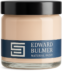
White is often the first choice when we want to create a light, airy interior, but not all whites behave in the same way. The brightest white can feel stark in some spaces, particularly when contrasted with warmer colours and natural materials. A pigmented white offers a softer alternative. With subtle undertones created through carefully selected earth and mineral pigments, these whites have just enough colour to bring warmth, depth and character without necessarily reading as a distinct colour on the wall. The key is finding the right white for your room, its natural light and the colours and materials surrounding it. Fine White kitchen by Kerri Lipsitz. Photography: Mariell Hansen What is a pigmented white paint? A pigmented white contains subtle amounts of colour that influence its overall character. Depending on the pigments used, a white might have warmer yellow, red or earthy undertones, or a cooler grey character. These differences can be subtle on a colour card but become much more apparent once the paint is used across an entire room. Our whites are created using the same carefully selected earth and mineral pigments found throughout our palette. This allows them to sit naturally alongside stronger colours rather than creating the sharp contrast you can sometimes get from a stark brilliant white. Milk White study. Photography: Paul Whitbread Spanish White kitchen by Westcot House & House of Kit. Photography: Michael Branthwaite Fair White dining room by Beauvamp Why choose a pigmented white? White occupies a large surface area in many interiors, so even a subtle undertone can influence the way a room feels. A carefully chosen pigmented white can soften strong natural light, bring warmth to a darker room or create a gentler relationship between walls, ceilings and woodwork. It can also be a colour in its own right. Rather than treating white simply as the default backdrop, consider its undertone, depth and relationship with everything else in the room just as you would any other paint colour. How does natural light affect white paint? Natural light can dramatically alter our perception of white. North-facing rooms tend to receive cooler light, which can emphasise cooler or greyer undertones. South-facing rooms usually receive warmer, stronger light, which can bring out warmth within a white and make subtle undertones more apparent. East- and west-facing rooms change considerably throughout the day as direct sunlight moves through the space. This is why testing your chosen white in the room itself is so important. Look at it in morning, afternoon and evening light, as well as under the artificial lighting you use after dark. Living room at Llanfendigaid Estate. Walls painted in Rose Tinted White and cabinets painted in Dove. Which pigmented white should you choose? Milk White Milk White is a warm white with a gentle, creamy character. Its warmth makes it an easy choice for spaces where you want the freshness of white without a stark finish. It works beautifully with natural materials and can be used across walls, ceilings and woodwork for a soft, understated scheme. Spanish White Spanish White is a very pale warm white with subtle yellow ochre undertones. It works particularly well where you want to introduce warmth while keeping the overall impression light. Its earthy character makes it a natural companion to timber, stone and stronger colours elsewhere in a scheme. Rose Tinted White Rose Tinted White introduces the faintest blush, giving it a warmer character without reading as obviously pink. It can be particularly effective in bedrooms, sitting rooms and other spaces where you want white to feel gentle rather than crisp. Lilac Pink 60% Despite its name, Lilac Pink 60% can read as a beautifully soft neutral. As a lighter shade of Lilac Pink, it offers a subtle alternative to a conventional white where you want a little more depth and colour. It can work particularly well in rooms where a brighter white would create too much contrast with the surrounding palette. Spanish White kitchen by @liserikssondesign Milk White bedroom at Thyme Bedroom painted in Lilac Pink 60% Order a free colour chart Should you use the same white throughout your home? You can, and repeating the same white across ceilings or woodwork can be a useful way to create continuity from room to room. However, you don’t need to choose one white for everything. Different rooms receive different natural light and may contain very different wall colours, materials and furnishings. You might therefore choose a warmer white in one room and a cooler or brighter white elsewhere, while maintaining a connection through the wider colour palette. How should you test white paint? Always test whites in the room where you intend to use them. Our A5 colour swatches allow you to move a colour between different walls and compare it directly with flooring, fabrics, furniture and other paint colours. Once you have narrowed down your choices, sample pots allow you to test a larger area. Pay particular attention to how the white looks beside other colours. A white that appears warm on its own can look quite different once placed alongside a strong green, blue, pink or yellow. Finding the right white for your home Choosing white deserves just as much consideration as choosing any other colour. Look beyond how light or bright it appears and consider its undertones, the natural light within the room and its relationship with the rest of your scheme. Explore our white paint colours, order A5 colour swatches and sample pots to compare your favourites at home, or speak to our Colour Consultants for help finding the right white for your space. Living room painted in Silver White
Court of Noke: Edward Bulmer’s historic Herefordshire home Step inside Court of Noke, Edward and Emma Bulmer’s Herefordshire home, and discover how more than 30 years of restoration, colour and considered decoration have shaped the house we see today.
Behind the Chatsworth Collection: 24 exquisite new paint colours Learn the story behind The Chatsworth Collection, a range of 24 new paint colours inspired by the interiors, heritage, and landscapes of one of this country’s most significant country houses.
On the paint road at Manchester Art Gallery Paint has always ultimately been a backdrop to beautiful furniture, pictures and fabrics. This extends beyond the domestic space and into public spaces, so we are thrilled that we are now working with the Manchester Art Gallery as their official paint sponsors, it’s a joy to see our colours serve as backdrops to so much culture, history and beauty.
How to create a cohesive colour scheme throughout your home Learn how to create a cohesive colour scheme throughout your home, choosing paint colours that respond to natural light, architecture and the way each room connects.
How to Choose the Right Paint Finish Choosing the right paint finish is important and we aim to ensure that you get perfect results in your home decorating. So here is your guide on how to pick the right paint finish for different rooms and surfaces.
How to Create a Conscious Christmas It’s that time of year where the Christmas music starts, the smells of mince pies and mulled wine lingers and Christmas tress are decorated! If you are feeling like us, we are aware that people might want to make efforts towards a conscious Christmas this year so we have put together some ideas so you can making your home, Christmas dinner and gifting more environmentally conscious as possible.