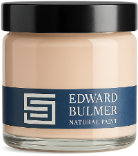
Pink has become one of the most versatile colours in interior decorating, moving well beyond its traditional associations with bedrooms and nurseries. From earthy plaster pinks to delicate blushes and dusky, brown-based shades, pink can be as useful as a neutral while bringing far more interest to a room. The secret lies in its undertones. A pink with yellow ochre will behave very differently from one with grey or brown in its composition, and understanding these differences can make choosing the right shade much easier. Edward Bulmer’s natural pink paints are created using carefully selected earth and mineral pigments, giving each colour its own distinctive character. Whether you’re decorating a hallway, kitchen, bedroom or sitting room, here’s how to find a pink that works with your space. Jonquil living room at Langdon Court. Photography: Brent Darby How to choose the right pink paint Not all pinks are alike. Some have a distinctly yellow or peachy warmth, while others lean towards grey, brown or even violet. Plaster pinks sit somewhere between pink, beige and yellow, making them particularly useful for walls throughout the home. Dusty pinks have a more muted appearance, often incorporating grey or brown undertones that help them sit comfortably alongside traditional materials and furnishings. Pale blush pinks offer a delicate touch of colour without the starkness of white. Deeper pinks can create striking contrasts on cabinetry, fireplaces and woodwork, or bring richness to an entire room. When choosing between shades, consider your room’s orientation, existing materials and the colours of your furniture and fabrics. Always sample your favourites in the space itself, as changing daylight can reveal undertones that aren’t immediately apparent on a colour chart. Rambling Rose bedroom by Octavia Dickinson. Photography: Boz Gagovski Jonquil: a warm plaster pink Jonquil is one of our best-selling pinks, loved for its versatility and distinctive yellow undertone. Sitting somewhere between pink, yellow and beige, it has the appearance of softly coloured plaster. Its name comes from an 18th-century colour associated with Dutch Pink, which was, despite its name, a yellow pigment. Jonquil’s yellow ochre gives it a welcoming quality, making it particularly useful in hallways, sitting rooms, kitchens and bedrooms. As Edward explains: “Jonquil is a lovely soft plaster colour which has become a go-to colour for any room in my house, as it is so versatile and seems to go with everything.” It works beautifully with natural timber, stone, antique furniture and patterned fabrics, providing a coloured alternative to conventional beige. For a lighter interpretation, Jonquil is also available in our Shade Collection. Discover more in our guide to decorating with Jonquil, our best-selling plaster pink. Jonquil bedroom by @townley_terrace Jonquil hallway by Thompson Bell. Photography: GPM Creative Jonquil living room by Anna Hewitson Cuisse de Nymphe Émue: a delicate dusty pink Cuisse de Nymphe Émue is one of Edward’s most distinctive colours, with a wonderfully evocative historic name. Softer and dustier than Jonquil, it has a delicate, creamy appearance that works beautifully in both traditional and contemporary interiors. Edward has used Cuisse de Nymphe Émue in his own bathroom, while the colour has also featured in bedrooms, kitchens and the changing rooms of British fashion brand ME+EM. Interior designer Joanna Plant has described it as an exceptionally flattering colour, which helps explain its appeal in rooms where people spend time getting ready. Its muted quality also makes it an excellent backdrop for decorative fabrics, antique furniture and artwork. For more on the history and enduring appeal of this distinctive shade, read our article In celebration of Cuisse de Nymphe Émue. Cuisse de Nymphe Émue bathroom by Anna Haines Cuisse de Nymphe Émue children's room with Brick bed nook byRachel Bottomley. Photography: Dean Hearne Cuisse de Nymphe Émue bedroom by Louise Roe Jonquil or Cuisse de Nymphe Émue? This is one of the questions our colour consultants are asked most frequently. The main difference is their undertones. Jonquil contains more yellow ochre, giving it a warmer, more plaster-like appearance, while Cuisse de Nymphe Émue is dustier and more delicate. As a starting point, Jonquil can be particularly useful in cooler, north-facing rooms where a little additional warmth is welcome. Cuisse de Nymphe Émue can work beautifully in brighter, south-facing spaces. However, there’s no universal rule. The effect will depend on the natural light, surrounding colours and materials in your particular room. Sampling both shades side by side is often the easiest way to see which one works best. Cuisse de Nymphe Émue bedroom by @quineandlooncottage Jonquil bedroom by @townley_terrace Lilac Pink: an earthy pink neutral Despite its name, Lilac Pink is neither an obvious lilac nor a conventional pink. Instead, it’s a wonderfully adaptable neutral with a subtle pink undertone. Its earthy colouring comes from pigments including Red Ochre and Yellow Ochre, which give it a grounded quality and prevent it from appearing overly sweet. Lilac Pink has been used throughout Edward and Emma Bulmer’s home, including their hallway and landing, where it provides a backdrop for artwork and architectural details. It’s particularly effective in rooms with a mixture of furnishings and finishes, from gilded frames and antique furniture to contemporary pieces. For a stronger contrast, consider pairing Lilac Pink walls with deep blue woodwork, as demonstrated in a sitting room designed by Sarah Brown. Edward explains the thinking behind the colour: “We believe that the secret to a good pink is its underlying tonality. To achieve this we use the earth pigment Red Ochre and a dollop of Yellow Ochre.” If you’re drawn to warm neutrals but want something more interesting than an off-white or beige, Lilac Pink is well worth sampling. Lilac Pink living room at The Quist Lilac Pink hallway with Pompadour woodwork. Photography: Tom St.Aubyn Lilac Pink living room with Tawny woodwork at Kingfisher Cottage Mason Pink: a soft, muted pink Mason Pink was created by Edward Bulmer for British fashion designer Anna Mason, who used the colour throughout her Belgravia atelier. Inspired by the pink undertones found in traditional masonry, including stone, brick and terracotta, Mason Pink is a beautifully muted yet recognisably pink shade. A touch of brown gives it a more settled appearance than a conventional pale pink, without taking away from its softness or freshness. Anna Mason was originally drawn to Cuisse de Nymphe Émue before working with Edward to develop a colour specifically for her space. Mason Pink is an excellent choice for those who love pink but prefer something muted and less obviously rosy. Used across walls and woodwork, it creates a cohesive setting for furniture, textiles and artwork, while its connection to the colours of natural masonry makes it particularly appealing in period interiors. Mason Pink front door by Camilla Barnes Mason pink bedroom by Amy Eld. Photography: Kit Dixon Smith Mason pink bedroom by Amy Eld. Photography: Kit Dixon Smith Our boldest pinks: Rose, Pompadour and Dahlia Pink Pink doesn’t have to be pale or understated. Some of the most exciting interiors embrace stronger shades, using them to bring colour to walls, cabinetry, furniture and architectural details. Whether you’re looking to make a statement with an entire room or introduce a smaller accent, these three pinks offer a more adventurous approach. Rose Rose is a brighter, more expressive pink, bringing a distinctly playful quality to interiors. Its stronger colouring makes it an excellent choice for painted furniture, doors or smaller areas where you want to introduce a burst of colour. We particularly love the combination of Rose with Etruscan Brown, where the contrast between bright pink and earthy brown creates a scheme that feels unexpected yet beautifully balanced. Rose living room by @hope_and_the_house Rose bathroom by @maasinteriordesign. Photography: @jaggerdesigncreative Rose hallway with Etruscan Brown panelling by Fiona de Lys. Photography: Rachael Smith Pompadour Pompadour offers a richer interpretation of pink, making it a wonderful choice for those looking to introduce stronger colour into their home. It works well on painted cabinetry, fireplaces and the interiors of bookshelves, where its depth can bring definition to a room. For a more adventurous approach, use Pompadour alongside softer pinks or contrast it with greens, blues and earthy neutrals. Pompadour living room with Nicaragua ceiling by That Rebel House Pompadour bathroom with Cuisse de Nymphe Émue walls by Laura Fantacci Pompadour shelving by @studioheroninteriors Dahlia Pink Dahlia Pink is a richly pigmented, dark petal pink inspired by the velvety dahlias that became favourites of Victorian English gardens. With strong red and orange tones, its colour comes from a carefully balanced combination of Red Ochre and Violet pigments. The result is a pink that feels both dramatic and uplifting, shifting in appearance as the natural light changes throughout the day. Dahlia Pink is particularly striking when used across an entire room, where its saturated colour creates a magnificent backdrop for artwork. It’s a wonderful example of how pink can be used with real confidence, bringing richness and personality to both traditional and contemporary interiors. Dahlia Pink dining room by Octavia Dickinson. Photography: Boz Gagovski Earthy and dusky pinks: Freudian, Nicaragua and Etruscan Brown For those who prefer pinks with more complex undertones, there are shades that move towards mauve, red and brown. These colours offer a different approach to decorating with pink, particularly in spaces where you want to create contrast with pale walls or complement richly coloured fabrics and antique furniture. Freudian Freudian is a rich mauve pink that sits somewhere between beige and faded rose petals. Inspired by the plain-weave fabric chosen by Laura Burlington as a backdrop for the work of Lucian Freud at Chatsworth, its colouring reflects the artist’s distinctive palette of ochres, blacks, blues and whites. Freudian has a particularly interesting relationship with light, glowing in daylight and taking on a richer appearance under lamplight. It makes an excellent choice for living rooms and bedrooms, where its muted colouring provides a beautiful backdrop for artwork, polished timber and both traditional and contemporary furniture. Freudian living room. Photography: Elena Bazu Freudian study. Photography: Elena Bazu Freudian at our London showroom. Photography: Elena Bazu Nicaragua Nicaragua is a deeper, smokier pink that demonstrates just how far the colour can move from its traditional pastel associations. It works particularly well when used to introduce contrast, whether on cabinetry, a fireplace or within a predominantly pale pink room. For a striking combination, pair Nicaragua with Drab Green. The relationship between the two colours creates a scheme that feels rich without relying on overly bright tones. Nicaragua and Wash Stop striped living room by Oka Etruscan Brown Despite its name, Etruscan Brown is closer to a deep pink-red than a conventional brown. Made using earth pigments, it recalls the richly coloured walls of Pompeii’s ancient palaces, an aesthetic that became fashionable in late 18th-century London. Its earthy red tones shift with the changing light, making it a striking choice for walls in living rooms, dining rooms and studies. Etruscan Brown is particularly effective as a backdrop for artwork, especially prints in black frames, where the contrast brings out the richness of the colour. For an unexpected pairing, try it alongside the brighter pink of Rose, allowing the two shades to play off one another. Etruscan Brown woodwork against Sky Blue walls at Kingfisher Cottage Etruscan Brown living room by Lorfords Etruscan Brown living room by Oka What colours go with pink paint? One of pink’s greatest strengths is its ability to combine with other colours. Earthy pinks in particular can work almost like neutrals, complementing everything from deep blues and greens to rich browns and reds. The most successful pairings often involve colours that share similar undertones or provide a deliberate contrast. Pink and green Pink and green is one of Edward Bulmer’s favourite combinations, bringing together two colours that appear naturally alongside one another in the landscape. In Edward’s own panelled sitting room, Pomona provides a soft green backdrop for pink furnishings. For a more earthy combination, try Drab Green with Nicaragua. The relationship between the colours gives the scheme a richness that works especially well with natural materials and patterned textiles. Pink and blue Blue provides a striking contrast to pink, particularly when stronger shades are introduced through doors, cabinetry or painted furniture. Deep blues such as Indigo and Azurite work beautifully alongside dusty pink walls, while Cerullian Blue offers a clearer, more vibrant alternative. This combination is also frequently found in patterned fabrics, making it a useful starting point when developing a room’s palette. Pink and brown Pink and brown is a particularly appealing combination for interiors that draw on natural materials. Earthy browns such as Etruscan Brown can bring definition to a soft pink scheme, whether used on woodwork, furniture or in an adjoining room. Mason Pink and Lilac Pink are especially well suited to this approach, as their own earthy undertones create a natural connection with deeper browns. Pink and red For a bolder scheme, consider combining pale or dusty pinks with deeper reds and richer pinks. Emma Bulmer, head of Colour Consultancy, recommends introducing shades such as Pompadour and Nicaragua through fireplaces, cupboards or the interiors of bookshelves. These stronger colours can bring contrast to a softer pink room without disrupting the overall palette. Cuisse de Nymphe Émue dining room with Tingry woodwork Passageway Pink bathroom with Fine Green cabinets. Photography: Elena Bazu Jonquil kitchen with Pompadour woodwork and Dove door frame, leading through to Invisible Green hallway at Court of Noke Find your perfect pink Whether you’re drawn to the plaster-like colouring of Jonquil, the delicate Cuisse de Nymphe Émue, the soft Mason Pink or the more expressive shades of Pompadour and Rose, there’s far more to pink paint than one particular look. If you’ve found a colour you love but feel the full shade is too strong for your room, our Shade Collection offers lighter versions of popular pinks, including Jonquil, Cuisse de Nymphe Émue and Lilac Pink, in 60%, 40% and 20% strengths. These variations can be used to create tonal schemes, pairing lighter walls with a stronger version of the same colour on woodwork or cabinetry. Above all, we recommend sampling your favourites at home and observing how they change throughout the day. A pink that appears subtle in morning light may reveal an entirely different character by evening. Explore our collection of pink paint colours or discover our Colour Consultancy services for expert help finding the right shade for your home.
Court of Noke: Edward Bulmer’s historic Herefordshire home Step inside Court of Noke, Edward and Emma Bulmer’s Herefordshire home, and discover how more than 30 years of restoration, colour and considered decoration have shaped the house we see today.
Behind the Chatsworth Collection: 24 exquisite new paint colours Learn the story behind The Chatsworth Collection, a range of 24 new paint colours inspired by the interiors, heritage, and landscapes of one of this country’s most significant country houses.
Brown paint colours: how to decorate with brown From rich tobacco browns and dark chocolate shades to softer earthy neutrals, explore our favourite brown paint colours, how to choose the right shade and which colours work beautifully together.
How to paint woodwork: a step-by-step guide Our step-by-step guide to painting skirting boards, doors and architraves, with practical advice on preparation, priming and application.
Kitchen paint colour ideas: from calming neutrals to bold colour Explore beautiful kitchen colour schemes, from calming neutrals and muted pinks to bold greens and colourful cabinetry, with advice on choosing the right shades.
On the paint road at Manchester Art Gallery Paint has always ultimately been a backdrop to beautiful furniture, pictures and fabrics. This extends beyond the domestic space and into public spaces, so we are thrilled that we are now working with the Manchester Art Gallery as their official paint sponsors, it’s a joy to see our colours serve as backdrops to so much culture, history and beauty.