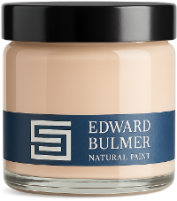
Choosing white paint might seem straightforward, but with so many different shades available, finding the right one can be surprisingly difficult. From creamy off-whites to delicate pinks and cooler, stone-inspired tones, even the smallest variation in pigment can change how a white looks and feels in a room. At Edward Bulmer Natural Paint, our whites are created using carefully selected earth and mineral pigments, giving each shade its own distinctive character. Whether you’re looking for a versatile white for your walls, a complementary colour for your woodwork or the perfect shade for your ceiling, here’s our guide to choosing the right white for your home. Milk White living room by James Mackie. Photography: James McDonald Why are there so many shades of white? White is rarely just white. The pigments used to create a shade influence its undertones and how it responds to different lighting conditions. Our Spanish White, for example, has a gentle yellow ochre influence, while Rose Tinted White contains red pigments that give it the subtlest suggestion of pink. Pearl Colour combines several pigments to create a more complex, softly coloured white. These subtle differences become particularly noticeable when a white is placed alongside other colours, natural materials or architectural details. Spanish White kitchen by @liserikssondesign Rose Tinted White living room by @townley_terrace Pearl Colour living room by Oka Understanding warm and cool whites One of the most useful starting points is to consider whether you want a white with warm or cool undertones. Warm whites contain subtle hints of yellow, red or other earthy tones. Shades such as Milk White, Spanish White and Chatsworth Cream are particularly effective when paired with timber, natural stone and traditional furnishings. Cooler whites may have grey, blue or green undertones, giving them a fresher appearance. Water Glass, for example, has a subtle blue-green character, while Silver White offers a delicate grey-white tone. Neither is inherently better. The right choice depends on the light, the other colours in the room and the atmosphere you want to create. Water Glass by Lorfords Antiques How does natural light affect white paint? Light has an enormous influence on how white paint appears. A shade that looks warm and creamy in one room may appear cooler or more muted in another. North-facing rooms generally receive cooler natural light, so a white with gentle yellow or red undertones can help balance this. In south-facing rooms, where the light is often stronger and warmer, you may have more flexibility to experiment with cooler whites. East-facing rooms receive brighter morning light, while west-facing rooms tend to become warmer towards the end of the day. It’s worth observing how your chosen white changes throughout the day before committing. Consider the materials already in your room As Edward Bulmer advises, choosing the right white isn’t simply about finding a shade you like in isolation. The existing materials in a room can be just as important. Stone flooring, timber beams, marble, upholstery and antique furniture all have their own undertones, which can influence how a white appears alongside them. A very bright white, for example, might create too much contrast against aged timber or traditional furnishings, while a more pigmented off-white can sit more comfortably within the scheme. Equally, a white with too much yellow or grey may not be the right choice for a lighter, more contemporary interior. The aim is to find a shade that complements the elements you already have rather than competing with them. Chatsworth Cream living room by Lorfords Our favourite white paint colours With a wide selection of natural whites to choose from, there’s a shade to suit almost every style of interior. Here are some of our favourites, along with examples of how they can be used. Milk White: a soft, creamy white Milk White is one of Edward’s personal favourites. With its gentle creamy tone, it’s a beautiful choice for walls, panelling and woodwork. In Edward’s own study, Milk White has been used across the walls and joinery, creating a continuous scheme that allows the room’s furnishings and architectural details to stand out. Milk White in Edward's study at Court of Noke Spanish White: a versatile warm white One of our most popular whites, Spanish White has a gentle yellow ochre undertone that makes it particularly versatile. It’s an excellent choice for ceilings, where it provides a softer alternative to a brilliant white, but works equally well on walls and woodwork. Spanish White is especially effective alongside earthy colours, natural timber and traditional architectural details. Spanish White kitchen with Drab Green cabinets by Westcot House & House of Kit. Photography: Michael Branthwaite Rose Tinted White: a delicate hint of pink Rose Tinted White contains subtle red pigments that give it the faintest blush of pink. It’s a lovely choice for bedrooms, bathrooms and living spaces, particularly where you want a white that feels gentle without appearing overtly pink. Its undertones become more apparent in changing light, making it worth testing in your room at different times of day. Bedroom painted in Rose Tinted White Silver White: a subtle grey-white For those who prefer a white with cooler undertones, Silver White offers a delicate hint of grey. It’s particularly effective when used throughout a home, providing a consistent backdrop while allowing the light and furnishings in each room to introduce their own character. Living room painted in Silver White Everywhere White: a stone-inspired off-white Part of our Chatsworth Collection, Everywhere White was inspired by the warm grey undertones of Derbyshire stone. Its understated character makes it a versatile choice for both walls and woodwork, particularly when paired with stronger colours. At Chatsworth, Everywhere White has been used to highlight the architectural mouldings of a grand, high-ceilinged room. Everywhere White at Chatsworth. Photography: Anna Batchelor Portland: a natural stone white Inspired by the colour of Portland stone, Portland is a softly coloured neutral created with earth and mineral pigments. In stylist Amy Bannerman’s coastal bedroom, Portland provides a beautiful backdrop to Clove on the mantelpiece and Invisible Green on the door. It’s a lovely example of how a white can bring together several different colours within one room. Amy Bannerman's bedroom with walls in Portland, woodwork in Clove and door in Invisible Green Water Glass: a fresh, blue-green white Water Glass has a subtle blue-green undertone that makes it an interesting alternative to more traditional creamy whites. It works particularly well alongside greens, greys and natural materials, and is also a beautiful option for painted woodwork. Water Glass dining room by Lisa Kay Canova: a fresh white from Chatsworth Another shade from the Chatsworth Collection, Canova is a fresh white that works beautifully in rooms where a lighter, clearer finish is desired. It can be used across walls and ceilings or paired with stronger wall colours to create a gentle contrast. Kitchen at Chatsworth with cabintry in Canova and walls in Passageway Pink. Photography: Anna Batchelor Which white should you use on ceilings and woodwork? Ceilings and woodwork are often treated as an afterthought, but choosing the right white for these surfaces can make a significant difference to the finished scheme. For ceilings, Spanish White and Canova are two particularly versatile choices. Both can provide a softer alternative to a stark, brilliant white. If you’re looking for a little more colour, a lighter shade such as Jonquil 20% can introduce a subtle pink undertone. For woodwork, consider whether you’d prefer a gentle contrast or a more continuous look. Pairing coloured walls with a complementary white can highlight skirting boards, doors and architraves, while painting the woodwork in the same colour as the walls creates a more unified scheme. Always test your white paint before choosing White paint can be particularly sensitive to its surroundings, so we always recommend testing a few shades before making your final decision. Order sample pots or A5 colour cards and view them in the room you’re decorating, alongside your flooring, furnishings and other paint colours. Observe your samples in morning, afternoon and evening light, as well as under artificial lighting. A white that looks perfect in bright daylight may appear quite different once the lamps are switched on. Living room with Cinnamon walls and Spanish White ceiling and woodwork by Studio Strachan Need help finding the right white? Choosing between several similar whites can be surprisingly difficult, but our experienced Colour Consultants are here to help. Whether you’re decorating a single room or planning a whole-house scheme, we can help you find the shades that work best with your space, lighting and existing furnishings. For more inspiration, explore our guide to pairing white paint with other colours.
Court of Noke: Edward Bulmer’s historic Herefordshire home Step inside Court of Noke, Edward and Emma Bulmer’s Herefordshire home, and discover how more than 30 years of restoration, colour and considered decoration have shaped the house we see today.
Behind the Chatsworth Collection: 24 exquisite new paint colours Learn the story behind The Chatsworth Collection, a range of 24 new paint colours inspired by the interiors, heritage, and landscapes of one of this country’s most significant country houses.
Jonquil, the best-selling plaster pink everyone needs in their home This is a good yellow pink so I have borrowed the name of a colour made with Dutch Pink in the 18th century (Dutch Pink was actually a yellow pigment). It might be called a plaster pink now that we use gypsum plaster for interior walls and has a wonderful soft hue that hovers between pink and yellow/beige.
Cult Colours & How to Style Them – Wicklewood X Edward Bulmer Natural Paint Colour Guide: Edition 1 We have teamed up with the doyennes of bright & colourful artisan homewares, Wicklewood, to bring you a series of inspirational and informative colour guides. A celebration of colour and timeless, beautiful interiors. Each guide will be packed full of really useful hints and tips on how to create your dream interior, along with beautiful room ideas to inspire you.
Colour in the Landscape by Pete Beckett In our London Showroom we are hosting a collection of colourful works by artist Pete Beckett. This exhibition shows a range of paintings with a variety of different subjects from abstract landscapes to more figurative depictions.