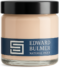
Choosing wall paint involves more than finding the right colour. From the ingredients and finish to coverage and durability, there are several factors worth considering before you pick up a paintbrush. The best wall paint should not only look beautiful but also suit the room, be straightforward to apply and perform well over time. Here are five things we believe are worth looking for when choosing paint for your home. Cinnamon living room by Anouska Tamony Designs. Photography: Nick George 1. Colour quality and natural pigments Colour is often the first consideration when choosing paint, but how that colour is created matters too. At Edward Bulmer Natural Paint, we use carefully selected earth and mineral pigments to create colours with richness and complexity. These pigments give our palette its distinctive character, allowing colours to respond beautifully to changing natural light and complement materials such as timber, stone and plaster. Whether you’re choosing a pale neutral or a richer shade, it’s worth testing samples throughout the day to see how the colour behaves in your space. For more advice, read our guide to how natural light affects paint colour. Duck Egg living room by Liza Philips Interiors Tingry pantry by Berdoulat. Photography: Paul Whitbread Mummy living room by James Mackie. Photography: James McDonald 2. Ingredients, breathability and environmental impact Understanding what’s in your paint is just as important as choosing its colour. Many conventional paints rely on petrochemical-derived plastic binders. Our natural paints are made using plant-based binders and carefully selected pigments, offering an alternative for those looking to reduce their use of plastic-based materials at home. Breathability is another consideration, particularly in older buildings with traditional plaster and masonry. Choosing an appropriate breathable finish allows moisture vapour to pass through the painted surface, helping walls manage moisture. It’s also worth looking at VOC content, ingredient transparency and how a paint is manufactured when comparing different products. Discover more about why we choose natural paint. Pomona living room by Thompson Bell. Photography: GPM Creative 3. Coverage and value for money The price of a tin doesn’t always tell you how much a decorating project will cost. When comparing paints, consider the recommended number of coats, coverage per litre and whether a primer is required. Our natural paints are formulated to offer excellent coverage, typically achieving the desired finish in two coats when applied to a properly prepared surface. While natural paints can cost more to produce because of their ingredients and formulation, it’s worth considering the overall cost of the project rather than the price per litre alone. London Brown living room. Photography: Paul Whitbread Lilac Pink walls and Pompadour woodwork. Photography: Tom St.Aubyn French Blue by Thompson Bell. Photography: GPM Creative 4. Ease of application and durability A good wall paint should be straightforward to apply, whether you’re decorating yourself or working with a professional. Our Natural Emulsion has a creamy consistency that makes it easy to work with, offering a beautiful matt finish for interior walls and ceilings. Preparation is just as important as the paint itself. Ensuring surfaces are clean, sound and appropriately primed will help achieve an even, lasting finish. For practical guidance, explore our painting advice and how-to guides. Tried and tested at home “Before I worked in the paint industry, I had no idea of the harm using a lot of modern paint could cause. Once you know the facts, they are hard to ignore. In our Edwardian terrace in London, we wanted to ensure the walls were looked after and chose Ethereal Blue for the living room, Lilac Pink 20% in the hallways and Mummy upstairs. I painted the rooms with help from family and even they said how lovely the paint was to work with, no smell, easy to use and we were all so impressed by the finish.” Louisa, Edward Bulmer Natural Paint team Mummy Order a Sample Ethereal Blue Order a Sample Lilac Pink Order a Sample 5. A thoughtfully designed colour palette Beyond the practical considerations, choosing colours that work together can make decorating considerably easier. Edward Bulmer draws on his experience as an interior designer and architectural historian to create colours inspired by historic interiors, traditional pigments and the natural world. Rather than treating each colour in isolation, our palette is designed to offer complementary combinations for walls, ceilings and woodwork. From established favourites to the 24 colours of The Chatsworth Collection, there are plenty of possibilities for creating a cohesive scheme throughout your home. For inspiration, read our guide to creating a cohesive colour scheme. Mason Pink bedroom by Amy Eld. Photography: Cathy Pyle Find the right paint for your home Whether you’re refreshing a single room or redecorating your whole home, taking the time to consider colour, ingredients, finish and coverage will help you make a more informed choice. Explore our natural paint collection and order samples to find the right colour for your space.
Court of Noke: Edward Bulmer’s historic Herefordshire home Step inside Court of Noke, Edward and Emma Bulmer’s Herefordshire home, and discover how more than 30 years of restoration, colour and considered decoration have shaped the house we see today.
Behind the Chatsworth Collection: 24 exquisite new paint colours Learn the story behind The Chatsworth Collection, a range of 24 new paint colours inspired by the interiors, heritage, and landscapes of one of this country’s most significant country houses.
Orange paint colours: 6 natural shades for your home Explore six orange paint colours, from vibrant Dutch Orange to earthy Brick and Herbarium, with inspiration for using orange throughout your home.
How to create a cohesive colour scheme throughout your home Learn how to create a cohesive colour scheme throughout your home, choosing paint colours that respond to natural light, architecture and the way each room connects.
How to use brown paint shades in interior design With the ability to exude charm and elegance, browns are not only extremely versatile, but match ever so chic-ly to a whole host of design styles, textiles and periods of home. From regency to retro, the colour brown has the ability to ground a space, but also provide that smooth backdrop that can accentuate so many other aspects to your room design.
In conversation with Beauvamp: handcrafted lampshades, colour and craftsmanship Meet Alice, founder of Beauvamp, and discover the craftsmanship behind her handmade lampshades, her love of decorative lighting and how she uses Edward Bulmer Natural Paint in her Georgian home.