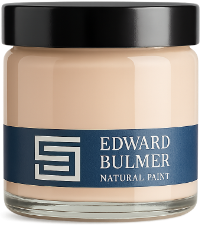
Choosing a colour is never just about seeing it once. It is about living with it, watching how it behaves as the light shifts through the day, how it sits beside furniture, textiles, art, and architecture. That is why we are delighted to introduce our new painted A5 colour swatches — a simple yet transformative way to decide on colour. Sample pot and A5 colour swatch Unlike printed cards, these swatches are painted with our natural paint, so what you see is the true colour. Its depth, its texture, its gentle response to light. At A5 size, they are large enough to make a meaningful impression, yet light and practical enough to move easily from room to room. Free Colour Chart For £1.50 each, they offer a flexible and efficient alternative to painting out sample pots. You can prop them against a skirting board, tape them to a wall, rest them on a chair, or place them beside fabric, flooring, or joinery. Move them throughout the day. Take them from a north-facing room into sunlight. Watch them at dawn, at dusk, and in lamplight. Colour reveals itself slowly, and these swatches are designed to let that conversation unfold naturally. Because the swatches are painted on a stable card rather than over existing wall colours, textures, or repairs, the finish is consistent and uncontaminated. What you are seeing is the paint exactly as it leaves our workshop — the same body, pigment balance, and surface quality that will appear on your walls at home. Together, this makes them an unusually honest representation of colour. It mirrors real life far more closely than a printed sample ever could. Customers will enjoy building a small collection, narrowing choices gently, living with possibilities rather than rushing to a decision. It is a calmer, more intuitive way to choose — and often leads to more confident, lasting results. Should you find yourself truly falling in love with them, there is another option. You can invest in a beautiful fabric-covered box containing a complete set of our painted swatches — a lasting reference, both practical and lovely in its own right. It is something to return to again and again, whether you are decorating one room or many over a lifetime. Because choosing colour should be a pleasure — unhurried, informed, and deeply personal. Full set of painted swatches in colour box Once you have narrowed your choice, it can be very useful to order a sample pot. This allows you to experience the paint itself — how it applies, how it feels under the brush, and how the finish settles as it dries. Our natural paints have a distinctive body and surface quality, and using a sample pot allows you to understand not just the colour, but the character of the paint, before committing to a full scheme. If you find yourself torn between favourites, our colour consultants are always on hand to help guide you — bringing clarity, confidence, and experience to the final decision.
Court of Noke: Edward Bulmer’s historic Herefordshire home Step inside Court of Noke, Edward and Emma Bulmer’s Herefordshire home, and discover how more than 30 years of restoration, colour and considered decoration have shaped the house we see today.
Behind the Chatsworth Collection: 24 exquisite new paint colours Learn the story behind The Chatsworth Collection, a range of 24 new paint colours inspired by the interiors, heritage, and landscapes of one of this country’s most significant country houses.
Big Tent Festival: Exploring Big Conversations At its core the Big Tent Festival and Foundation is about making a difference by actively supporting the new conversations, approaches and leaders required to refresh our political discourse.
How natural light affects paint colour Learn how natural light affects paint colour throughout the day and how room orientation can help you choose the right colours for your home.
B Corp Month – We ask fellow founders about their journey, from first steps to the future March is the month dedicated to B CORP and this year the #thiswayforward. A focus on continuance and hard work after gaining your B Corp status. We have chatted 3 fellow brands striving to be better, whilst putting people and planet before profit. Celebrating what it means to be part of the community over the next month we will be sharing what it means to us, the highs, the lows and how it feels to be alongside other brands who are also taking the step to be better.
Colour drenching ideas One of the emerging trends of 2025 is colour drenching. For anyone wondering, this is simply painting a room in a single colour, allowing the colour to flow across walls, ceiling and trims. This is a brave way to decorate, but it creates harmony, depth and a strong visual impact. Dive in for colour and design and be inspired.