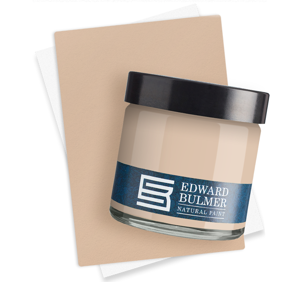
There are certain houses that live in the imagination long before you step through their doors. Chatsworth House is one of them. All honeyed stone and rolling parkland, it has come to define the idea of the English country house – at once grand, storied and deeply lived in. It’s this very spirit that lies behind The Chatsworth Collection, a new range of 24 paint colours by Edward Bulmer Natural Paint, created in collaboration with Laura Burlington and the Chatsworth team. Crace. Photography by Anna Batchelor For Edward, the project was as much about atmosphere as archaeology. “Chatsworth is one of those fabled places,” he reflects. “I still see it as the supreme example of this country’s great family homes.” Rather than working in isolation, he and Laura walked the house together – through passageways and private rooms, kitchens and libraries – pausing over fragments of old paint, the faded silk of a bedroom, the patina of a cupboard door. “Walking and talking around the venerable old house, we evolved a palette that can be seen as ‘Chatsworth in a blink of an eye’.” Laura’s introduction to Edward’s paints came through sustainability. In 2020, Chatsworth’s building manager began searching for breathable, natural finishes suitable for its historic fabric. “He understood the importance of the paint choices we make in caring for these buildings,” she recalls. “I became a convert.” What followed was a meeting of minds – a shared belief that beauty and environmental responsibility should go hand in hand. Photography by Elena Bazu Photography by Elena Bazu Photography by Elena Bazu Edward drew on what he calls the house’s “survivals, remembrances and evocations”: original finishes still clinging to cabinetry, schemes recorded in old paintings, tones lifted from stone, artworks and the surrounding landscape. Some shades are direct descendants of particular moments at Chatsworth. Crace nods to the Lower Library; Unfinished takes its cue from a watercolour by William Henry Hunt; Queen of Scots echoes silk in the Scots Bedroom; Cyanotype recalls a historic print discovered in the house. Elsewhere, composite hues capture an impression – a coup d’oeil – of Chatsworth in a single glance. The inspiration behind Freudian. Photography by Elena Bazu But this was never about nostalgia alone. The colours were tested in some of the estate’s quieter working spaces – the butler’s pantry, the laundry room, the 18th-century kitchen – where practicality matters as much as poetry. “We sense-checked the usability of the colours,” Edward explains, ensuring they would translate effortlessly into rooms of every scale and character. The result is a collection that feels both rooted in history and entirely at ease in modern life. Think of it as Chatsworth distilled: 24 shades that carry the memory of a great house, yet versatile enough to bring poise and personality to any interior.
Discover the new ‘Forever Favourites Collection’ Create a scheme from one room to your whole house with soft colours that work together effortlessly ensuring tonal flow and harmony. Our 12 best loved shades together in one pack. Discover the power of natural paint today.
We give to you: Our Christmas Advent We are now readying ourselves for that ever important gift list to our friends and family – gifts to treasure or even gifts we just want to keep to ourselves…
Aspiga: Sustainable & Stylish In Aspiga we have discovered a founder who is as committed as our own and a company who really are showing others how to do business the right way. Aspiga are leading the way to being the home of sustainable and ethical fashion – putting people and our planet first – with stylish cutting edge designs.
The Power of Natural Pigments: Issue 4 Discover again this month more about the natural earth and mineral pigments we use to create our colours which are far more sophisticated and subtle than synthetic AZO dyes used by most paint companies.
Colour schemes for west-facing rooms: natural paint ideas for UK homes The colour in a west facing room alters greatly depending on the time of day. Paint colours come alive in the late afternoon and early evening with a warmer light, but can appear cooler in the morning shadows. Whatever you plan to use your room for, choosing the right paint colour is essential to harness the beauty and mercurial nature of the west-facing light.