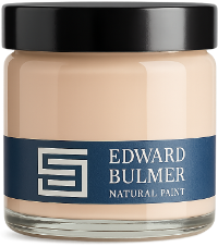
Edward Bulmer Natural Paint and interior designer Octavia Dickinson have joined forces to launch The English Garden Palette, introducing three new paint colours inspired by the garden: Dahlia Pink, Hedge Mustard and Rambling Rose. Edward Bulmer Natural Paint and interior designer Octavia Dickinson have joined forces to create The English Garden Palette, a collection of twelve paint colours inspired by the layered beauty of an English garden. The palette introduces three new colours – Dahlia Pink, Hedge Mustard and Rambling Rose – alongside nine existing shades from the Edward Bulmer Natural Paint collection: Blue John, Burlington, Hawtrey, Fine Green, Olympian Green, Celadon, Creami Colour, George and Cyanotype. Hedge Mustard Rambling Rose Dahlia Pink An English garden-inspired paint palette Designed to work together rather than as standalone statement colours, the twelve shades explore the relationship between colour, art and interior design. From traditional country houses to contemporary interiors, they provide a versatile foundation for walls, cabinetry and woodwork, complementing artwork, antiques, textiles and natural materials. Known for her richly layered interiors, interior designer Octavia Dickinson brings her distinctive use of colour, pattern and texture to the collaboration. Her work combines a deep appreciation for English decorative tradition with a fresh and contemporary sensibility. Edward Bulmer shares Octavia’s belief in interiors that are beautiful, considered and designed to last. His historically informed approach to colour and use of earth and mineral pigments provide the foundation for a palette rooted in the natural world. Together, Edward and Octavia have created a collection that celebrates colour as an integral part of an interior, with twelve shades designed to work harmoniously alongside paintings, furniture, antiques and treasured objects. To celebrate the launch, we spoke to Octavia about the inspiration behind The English Garden Palette, decorating with colour and how she would use the three new shades. Rambling Rose bedroom, photography by Boz Gagovski In conversation with Octavia Dickinson The launch introduces three beautiful new colours created by yourself and Edward. How do you see colour influencing our mood, wellbeing and the way we feel in our homes? Colour is integral to our lives and has a huge influence on how we feel. I use colour and colour combinations to create a certain mood in a room; particular colours are uplifting and work for rooms where we want to feel lively and social, whereas in rooms such as bedrooms and bathrooms, more grey-based tones that are less sharp and contrasting calm our brains and allow for a more relaxed state. Rooms are made up of a multitude of layers of colour, texture and pattern, and it is through the combinations we put together that we can manipulate how we feel in a room, and ultimately our own mood and wellbeing. Dahlia Pink dining room, photography by Boz Gagovski How would you describe The English Garden Palette? The Palette is a collection of twelve colours, inspired by nature, that can be used both inside and out, to form an extension of the English garden. A huge part of the English Country style, which I am known for, is the use of floral patterns and colours originating in the garden, and this palette is the perfect base for such a scheme. Both Edward and I are very much influenced by the natural world and we wanted to create a palette that reflects the huge importance it has on us as designers. As a whole, the palette provides a wonderful range of tones that work together exclusively, but can also be taken apart and used in groups or singularly to still bring a bit of the natural world to a scheme. Hedge Mustard living room, photography by Boz Gagovski Talk us through each of the three new colours and how they make you feel. Hedge Mustard is an ochre/mustard yellow with rich tones of orange and brown. Its dirtiness makes it perfect for utilitarian areas, while the orangey undertones emerge when lit up and make it a very happy-feeling colour. Dahlia Pink is a colour I feel very close to, having wanted to create this colour for a long time. The orangey, browny, red base of this pink gives the colour an incredible depth and richness. Dahlia Pink feels very joyful. It is also a truly wonderful backdrop to works of art, both old and modern. Rambling Rose is the lightest of the three new colours, and gloriously mimics a suffused petal, having the effect of a very light purple gently washed over a light pink. It is an incredibly pretty colour and very calm and relaxing. Rambling Rose bedroom How do you approach the relationship between artwork and the colour of the wall behind it? Creating successful interiors is all about creating the right balance and relationship between various contrasting elements; the right balance of colours, light and dark, femininity and masculinity, soft and hard, pattern and plain. The same approach is needed when choosing where to hang art and what colour to hang it on. It does not need to be the perfect complementary colour combination, but it is important that the colour enhances the work of art and vice versa. I also do not look at one piece of art solely, but in tandem with the other pieces in the room, along with the surrounding furniture. It is a balancing act and all things need to be considered to create the right balance. Hedge Mustard living room How would you use each of the new shades in an interior, and what kinds of rooms or spaces do you think they are particularly suited to? What I love about the three new shades is how versatile they are. This is due to the wonderful natural pigments Edward Bulmer uses to make them, as well as the combination of pigments within them. Rambling Rose works so very well as a wall colour. I already have it in my bedroom and it feels very calm, but I can see it working wonderfully in an expansive space upstairs and along corridors, as it picks up different light sources and reflects different colours. It would also be a very pretty drawing room colour. Hedge Mustard I definitely see as being useful on woodwork in back-of-house, utilitarian rooms, where a bit of dirtiness is wanted in a colour. But due to the depth of the colour, it will also be well suited to dining rooms with lots of candle flickers, and drawing rooms and studies – rooms that have pockets of well-lit areas and darker areas. I would like to colour drench a downstairs loo in Dahlia Pink, or use it alongside a wonderfully rich wallpaper. Dahlia Pink is a very good colour to hang artworks on, so it is very well suited to drawing rooms and dining rooms and would look very striking in a hallway. Dahlia Pink dining room How does natural paint change the feel of a colour? Natural pigment gives the paints a depth of colour that you don’t get in synthetic paints. The finish is a lot more chalky, more natural, which imitates the nature of the mineral pigments. Overall, the colours feel more alive, reflect light better and create a richer and warmer finish. Explore The English Garden Palette The English Garden Palette is available in sample pots and sustainable A5 swatches, as well as across our natural paint finishes. Explore the full collection and discover Dahlia Pink, Hedge Mustard and Rambling Rose., alongside the nine existing Edward Bulmer colours selected by Edward and Octavia. Not sure where to start? Our colour consultants can help you choose colours and create combinations suited to your home, its light and its architecture. Blue John Order a Sample New Rambling Rose Order a Sample New Dahlia Pink Order a Sample New Hedge Mustard Order a Sample Burlington Order a Sample Hawtrey Order a Sample Fine Green Order a Sample Olympian Green Order a Sample Celadon Order a Sample Creami Colour Order a Sample George Order a Sample Cyanotype Order a Sample
Court of Noke: Edward Bulmer’s historic Herefordshire home Step inside Court of Noke, Edward and Emma Bulmer’s Herefordshire home, and discover how more than 30 years of restoration, colour and considered decoration have shaped the house we see today.
Behind the Chatsworth Collection: 24 exquisite new paint colours Learn the story behind The Chatsworth Collection, a range of 24 new paint colours inspired by the interiors, heritage, and landscapes of one of this country’s most significant country houses.
Why breathable paint matters for period properties Discover why breathable natural paint is essential for period properties. Learn how traditional paints protect historic buildings better than modern sealants.
Step into ‘The Cutting Garden’: A floriferous collaboration with Thyme & Bertioli “To fill the house with freshly cut flowers must be one of life’s greatest joys” The inspiration behind the collection is all about bringing the outside in with a focus on the English CHouse aesthetic. A focus on nature, pairs perfectly with our plant-based paints. interior design
Constance Spry and The Fashion for Flowers This summer the Garden Museum will be celebrating the doyenne of flowers, the 20th century’s most influential floral decorator, Constance Spry. Guest curated by floral designer and writer Shane Connolly, this new exhibition will explore Spry’s exceptional life, achievements and legacy, with exclusive access to her archive at the RHS Lindley Library.
The power of stripes: a step-by-step guide to striped walls in UK interiors There’s something quite liberating about stripes! You know where you are with them: they’re trustworthy, clean and pleasing to the eye, giving a sense of complexity, order and sophistication. Even in a room full of bold colour, they’ll always stand out.