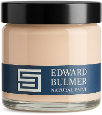
We’re delighted that Header, our soft, peach-toned terracotta, has been recognised with the Colour of the Year award from Homes & Gardens. Created by Edward Bulmer as part of our Palette Blenders collection, Header offers a gentler interpretation of traditional brick red, combining earthy red pigmentation with yellow ochre to create a wonderfully versatile colour. The award celebrates a shade that has quickly become a favourite for its ability to introduce colour without overwhelming a room. Header living room by Max Rollitt. Photography: Ed Rollitt The story behind Header Header was developed as a softer alternative to our deeper shade, Brick, taking inspiration from the mellowed red brickwork found throughout British architecture. Edward explains: “Much of the brick in this country is red brick and conforms to a fairly standard earthy red. When it mellows and fades it only becomes more beautiful. Our shade, Brick, is often used to great effect – rich and enveloping; but when you don’t quite have the light for it, you need a shade of less strength.” By reducing the strength of Brick and introducing yellow ochre, Edward created a softer, more peach-toned colour. Its name comes from traditional bricklaying terminology: the long face of a brick is known as the stretcher, while its shorter end is the header. The result is a colour rooted in architectural history but equally suited to contemporary interiors. Header living room by Max Rollitt. Photography: Ed Rollitt Header bedroom by Max Rollitt. Photography: Ed Rollitt Header bedroom by Max Rollitt. Photography: Ed Rollitt Decorating with Header With its balance of red and yellow undertones, Header sits somewhere between terracotta, peach and earthy pink. It works beautifully in sitting rooms, bedrooms and dining spaces, providing a colourful backdrop for natural wood, stone, antique furniture and patterned textiles. For a tonal scheme, Header can be paired with other earthy colours, while softer whites and neutrals provide a gentle contrast. Interior designer Max Rollitt chose Header for his showroom, where its subtle variation in different lighting conditions is particularly effective. As Max explains: “The thing I’ve always loved about Edward Bulmer paint is that it’s not just a flat finish, it has a real resonance to it. That’s especially true of Header, with its softness and warmth – you can almost feel the movement of light within it.” Header living room by Max Rollitt. Photography: Ed Rollitt Discover Header Header has been developed to sit comfortably alongside the wider Edward Bulmer Natural Paint palette, offering another way to bring natural colour into the home. Made using our carefully selected earth and mineral pigments, it demonstrates how a colour inspired by historic materials can feel entirely relevant to modern decorating. We’re delighted to see Header recognised by Homes & Gardens, and grateful to everyone who has embraced this distinctive shade. Explore Header and order a sample pot or hand-painted A5 colour card to see how it works in your own home.
Court of Noke: Edward Bulmer’s historic Herefordshire home Step inside Court of Noke, Edward and Emma Bulmer’s Herefordshire home, and discover how more than 30 years of restoration, colour and considered decoration have shaped the house we see today.
Behind the Chatsworth Collection: 24 exquisite new paint colours Learn the story behind The Chatsworth Collection, a range of 24 new paint colours inspired by the interiors, heritage, and landscapes of one of this country’s most significant country houses.
The Seven Best Hallway Paint Colours Read our advice on how to create a welcoming and harmonious hallway. Here we take a look at seven ways you can transform your space with natural colour and make an impact on entrance.
The Talk of the ‘Ton’: How to Recreate the Wonder of ‘Bridgerton’ in your own Home If you haven’t already watched the glorious Bridgerton, or even if you aren’t a fan, then you now have another excuse. The Houses! There has been much speculation on the beautiful architecture, with wisteria in permanent bloom, Wedgwood blue hues and opulence in abundance. What is not to love!
British Luxury: What it means to be a Walpole Brand of Tomorrow Walpole is the UK’s only business organisation for luxury brands, spanning across many sectors, it helps uplift and sing the praises of all the wonderful luxury brands the UK has to offer.
Is a colour consultancy worth it? Expert advice and real transformations Wondering whether to book a colour consultancy? Discover how professional colour advice works, when it’s worth considering and the difference it can make to your home.